
A cabinet color can make a dated kitchen feel current without changing the footprint, countertops, or appliances. But a color that looks great in a photo may feel too cool, too dark, or too trendy once it is covering 30 cabinet doors in your own home. This guide to cabinet color trends focuses on choices that look good now while still making practical sense for Denver-area homeowners.
Cabinet painting is a high-visibility update, so the right decision starts with more than a paint chip. Natural light, existing finishes, cabinet condition, how long you plan to stay in the home, and the quality of the preparation all matter. A well-chosen color and a properly applied cabinet coating can provide the clean, factory-style finish homeowners want. A rushed color choice or poor prep can do the opposite.
Guide to Cabinet Color Trends: What Is Lasting
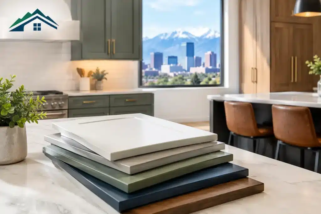
The strongest cabinet trends are less about a single must-have shade and more about warmth, contrast, and materials that make a kitchen feel lived in rather than overly staged. Bright, stark white cabinets have not disappeared, but many homeowners are moving toward softer whites, warm neutrals, muted greens, and natural wood tones.
The goal is not to chase every new color. It is to find a finish that supports the style of the house, works with fixed elements, and will still feel comfortable a few years from now.
Soft whites are replacing icy whites
White remains one of the most dependable cabinet colors, especially for smaller kitchens, homes being prepared for sale, and spaces with limited natural light. The shift is toward whites with a warmer undertone. Creamy off-whites, soft ivory, and balanced white shades tend to work better with wood floors, brass hardware, beige-tan stone, and warmer modern lighting than a sharp blue-white.
That said, warm white is not automatically right for every kitchen. If countertops have a distinctly cool gray background, an overly creamy cabinet color can look yellow by comparison. Sampling the paint next to the countertop, backsplash, flooring, and trim is more reliable than choosing from a small fan deck.
Earthy greens and blue-greens add color without shouting
Muted sage, olive, eucalyptus, and gray-green cabinets are popular because they bring in color while still behaving almost like a neutral. These shades pair well with natural wood, matte black details, aged brass, and warm white walls. They are especially effective on a kitchen island or a lower cabinet run when homeowners want personality without committing to a fully colored kitchen.
Blue-green and softened slate blue can create a similar effect. The key is restraint. A dusty, complex blue usually has more staying power than a bright coastal blue. In Colorado homes with abundant sunlight, a color can read lighter and more intense during the day, so a large sample board is worth the extra step.
Natural wood and painted cabinets are being mixed
The all-painted kitchen is no longer the only polished option. Many homeowners are combining painted perimeter cabinets with a wood island, wood hood surround, or open shelving. Others are preserving upper or lower wood cabinets when the grain and door style are worth keeping.
This look works best when the wood finish is intentional. Orange-toned oak next to a cool gray cabinet color can feel disconnected, while a neutralized or medium-warm wood tone can add depth. Sometimes refinishing or toning the wood is the better move than painting every surface one color.
Rich dark colors work best with enough light
Deep navy, charcoal, black, and near-black green cabinets are still a strong choice for islands, bars, offices, and larger kitchens. They create contrast and can make simple cabinet profiles feel more tailored. Darker colors also hide minor day-to-day marks better than white in some areas.
Their trade-off is visual weight. Dark cabinets can make a narrow kitchen feel smaller, and they show dust, cooking residue, and fingerprints differently than mid-tone colors. They generally need balanced lighting, lighter wall colors, and enough visual relief from countertops or backsplash. For many homes, using a dark tone on the island rather than every cabinet delivers the same impact with less risk.
Start With What You Cannot Easily Change
Cabinets can be repainted. Quartz, granite, tile, flooring, and expensive appliance finishes usually stay in place. That is why those fixed elements should lead the color conversation.
Look at the undertones rather than the obvious color. A white countertop may carry warm beige veining, cool gray veining, or a mix of both. Wood floors may lean golden, red, gray, or neutral. Even stainless appliances can look cool against creamy cabinets. Bring large paint samples home and view them morning, afternoon, and evening under your installed lighting.
Cabinet hardware deserves attention, too. Satin brass often supports warm whites, greens, and natural wood. Matte black can work across many palettes but adds sharper contrast. Brushed nickel remains flexible, particularly with soft whites, greige, and blue-gray tones. You do not have to replace hardware to repaint cabinets, but changing worn pulls can make the final result feel more complete.
Choose Color Based on Your Goal
A homeowner planning to stay for ten years can make a more personal choice than someone listing a home next month. Neither approach is wrong. The color should match the purpose of the project.
For resale, soft white, light greige, warm taupe, and restrained blue-gray are usually safer than highly specific colors. They help buyers picture their own furnishings in the space and photograph well when paired with clean walls and repaired surfaces. A seller does not need a bland kitchen, but the finish should appeal broadly.
For a long-term home, choose a color you enjoy living with. If you keep returning to olive green or a deep blue island, that preference matters. Cabinet color is not permanent, but repainting is still a meaningful project, so it should feel intentional rather than impulsive.
For rental or light-commercial spaces, durability and maintenance may carry more weight than a trend. A mid-tone neutral can conceal everyday wear better than pure white while keeping the room bright. In busy environments, the coating system and surface prep are every bit as important as the color.
Do Not Judge a Cabinet Color on a Wall Sample Alone
Cabinet doors catch light differently from drywall. They have corners, profiles, sheen, shadows, and a much denser concentration of color. A shade that looks subtle on a wall can feel much stronger on cabinetry.
Paint sample boards are helpful, but placing a removable painted sample against an actual cabinet door is even better. Keep it near the backsplash and countertop, then move it to areas with different light. Check it with lights on at night. This process often reveals whether a gray looks purple, a white reads yellow, or a green becomes too saturated.
Sheen also changes the result. Cabinet coatings are commonly selected in a finish that is washable and durable while avoiding a plastic-looking shine. Higher sheen reflects more light and can highlight door imperfections. Lower sheen softens reflection but still needs to stand up to cleaning. A professional recommendation should account for cabinet material, door condition, household use, and the look you want.
A Trendy Color Cannot Fix Tired Cabinet Surfaces
Before painting begins, cabinet boxes and doors need to be cleaned, degreased, repaired, sanded or scuff-sanded as needed, primed with the correct bonding product, and finished with a cabinet-grade coating. Doors with peeling finishes, worn edges, grease buildup, or damaged veneer require more attention than a standard wall-painting project.
This is where the lowest estimate can become expensive later. Cabinet painting involves removing and labeling doors, protecting countertops and floors, addressing surface defects, and allowing proper cure time. The result should not simply be a new color. It should be a smooth, durable finish that holds up to normal kitchen use.
At Majestic Painting Company, the cabinet color discussion happens alongside an on-site look at the cabinet condition, lighting, repairs, and desired finish. That gives homeowners a clearer scope, written options, and a recommendation based on the room instead of a generic trend chart.
Make the Decision Feel Manageable
If choosing one cabinet color feels overwhelming, narrow the field to three directions: a soft neutral, a muted color, and a deeper contrast option. Compare each against the elements already in the room and decide which one serves your goal best. The answer may be a whole-kitchen repaint, a two-tone layout, or a refreshed island paired with existing perimeter cabinets.
The best cabinet color is the one that looks right in your light, works with your surfaces, and is applied with the preparation it deserves. A careful walkthrough and a few well-tested samples can turn a big kitchen decision into a straightforward next step.