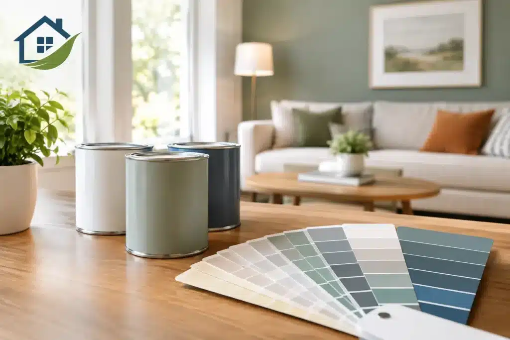

A buyer can forgive an older light fixture or a dated faucet. It is much harder to look past a room painted in a very personal color, especially when that color makes the space feel dark, small, or high-maintenance. The best paint colors for resale are not about making a home bland. They are about giving buyers a clean, current backdrop where they can picture their furniture, routines, and style.
For sellers, paint is often one of the most practical pre-listing improvements available. It can make repaired drywall disappear, brighten rooms with limited natural light, and help an older property feel cared for without taking on a full renovation. The right choice depends on the home’s fixed finishes, lighting, price point, and condition, but a few principles consistently help homes show better.
What Buyers Want From Paint Colors
Most buyers respond well to rooms that feel clean, well maintained, and easy to personalize. That usually means restrained colors with enough warmth to feel inviting. Stark white walls can read cold or unfinished, while heavy beige, yellow, red, and deeply saturated colors can make buyers think immediately about repainting.
A resale-friendly color should also work with the features you are not changing. Flooring, countertops, stone fireplaces, tile, cabinetry, and trim all carry undertones. A paint color that looks pleasant on a small sample can clash with a warm oak floor or cool gray tile once it covers an entire room.
In the Denver metro area, this matters even more because bright sunshine can intensify undertones. A gray that looks balanced in a store may appear blue in a north-facing room. A creamy neutral can look more yellow in strong afternoon light. Testing larger samples on more than one wall is a small step that prevents an expensive surprise.
Best Paint Colors for Resale Inside the Home
The strongest interior resale palette is usually a coordinated group of warm whites, soft greiges, light taupes, and muted green-gray neutrals. These shades feel current without locking a buyer into a strong design direction.
Warm white for trim and bright common areas
Warm white is a dependable choice for ceilings, trim, doors, and many living areas. It reflects light well and gives rooms a fresh finish, particularly when the existing trim is worn or yellowed. The key word is warm. A white with a subtle cream or soft gray undertone usually feels more comfortable than a sharp, blue-white shade.
Warm white can also be the right wall color for smaller homes, hallways, and rooms with limited windows. However, all-white interiors are not always the best answer. In a large open-plan home with white cabinetry and pale flooring, using white everywhere may make the rooms blend together. A light neutral on the walls can create more depth while keeping the overall look bright.
Soft greige for broad appeal
Greige, a balanced mix of gray and beige, remains one of the safest choices for main living spaces. It offers the clean, tailored look many buyers expect while still working with warmer woods, tan stone, and traditional finishes commonly found in established Colorado homes.
Choose a pale to mid-light greige rather than a dark or heavily gray version. Darker colors can be attractive in a finished, well-lit space, but they reduce light reflection and make any wall imperfections more noticeable. A soft greige is especially useful when a home has a mix of warm and cool finishes and needs a color that connects them.
Light taupe for warmth without heaviness
Light taupe is often a smart alternative when gray walls feel too cool. It gives a room a grounded, welcoming look and pairs well with oak, medium-brown flooring, travertine, brick, and warm-toned countertops. The best resale taupes are muted and light enough that they do not read brown.
This family of colors works well in bedrooms, dining rooms, and living rooms where sellers want more warmth than white provides. It also tends to photograph well, provided the finish is even and the lighting is handled properly.
Muted green-gray for selective spaces
Not every room needs to be neutral beige or greige. A soft sage, eucalyptus, or green-gray can add personality in the right location. Powder rooms, laundry rooms, offices, and bedrooms are good candidates because the color creates interest without overwhelming the entire home.
Keep these choices muted. Bright mint, strong olive, and dark forest green are more taste-specific. A calm, gray-based green is easier for buyers to accept and often complements natural wood, black hardware, and white trim.
Rooms That Deserve Different Choices
Using one coordinated wall color throughout a home is often the simplest route to a polished listing. It reduces visual stops as buyers move from room to room and makes touchups easier. Still, certain rooms benefit from their own approach.
Kitchens and bathrooms should feel especially clean. If cabinets are in good condition, a warm white or very light greige wall color can help them stand out. When dated wood cabinets are the main issue, cabinet painting may deliver a stronger result than wall paint alone. White, soft off-white, or a restrained warm gray cabinet finish can modernize the room, but the chosen color needs to work with the counters, backsplash, and floor.
Bedrooms can handle slightly softer, more restful shades than the main living areas. Pale taupe, quiet green-gray, or a warm off-white are usually safer than bold navy, purple, black, or bright pink. A child’s room does not need to be stripped of all character, but repainting a highly personalized color can help buyers focus on the room’s size and function.
For ceilings, white is almost always the right resale decision. A clean ceiling makes rooms feel taller and signals that the home has been maintained. If the ceiling has stains, cracks, texture damage, or past patching, repair and preparation matter as much as the topcoat.
Finish and Preparation Affect Resale, Too
A good color cannot compensate for poor preparation. Buyers notice cracked caulk, nail holes, peeling trim, roller marks, and paint on hardware. These details can make a freshly painted house feel rushed, while a smooth finish makes even modest updates look intentional.
For most resale projects, a flat or matte finish works well on walls because it minimizes the appearance of small surface flaws. Eggshell can be a practical option in busy areas when the walls are in good condition and a little extra washability is useful. Satin is commonly used on trim, doors, and cabinets because it offers a clean, durable sheen without looking overly glossy.
Do not skip repairs simply because the house is going on the market. Drywall patches, damaged baseboards, worn window trim, and failed exterior caulk can stand out more after new paint is applied. Addressing those items before painting gives the final result a much more credible, move-in-ready appearance.
Exterior Colors Should Fit the Neighborhood and the House
Exterior paint has a major effect on curb appeal, but resale choices require more caution than interior colors. A home should look refreshed, not disconnected from its architecture or surrounding streetscape. Soft warm gray, taupe, beige, off-white, and muted blue-gray can all work well, depending on the roof, masonry, and landscaping.
For trim, a clean off-white, deep bronze, charcoal, or near-black may provide the contrast the home needs. The right answer depends on the body color and fixed materials. Near-black trim can look sharp on a contemporary home, for example, but may feel too harsh against a light tan brick ranch.
Before choosing an exterior color, look at the roof in full daylight. Roof shingles often contain brown, gray, green, or blue undertones that should guide the paint selection. Also consider homeowner association requirements, if applicable, before ordering materials or scheduling work.
Common Resale Color Mistakes to Avoid
The goal is not to erase every bit of personality. It is to avoid choices that create hesitation. Deep accent walls, bright primary colors, heavy yellow-beige, and very cool gray can all narrow appeal when used across large areas.
Another common mistake is selecting colors from a tiny paper swatch. Paint is influenced by the direction of the light, surrounding finishes, sheen, and even landscaping outside the window. Large test samples, viewed morning and evening, provide a much more reliable answer.
Finally, avoid painting only the most obvious wall while leaving stained trim, damaged doors, or poorly matched touchups nearby. Buyers see the complete condition of a room, not just the new color.
A well-planned paint refresh should make the home feel easier to buy, not merely different. Majestic Painting can help sellers assess repairs, choose colors that fit the home’s existing finishes, and create a clear scope before work begins. When the paint looks clean, coordinated, and professionally finished, buyers can spend less time calculating projects and more time imagining a life in the home.