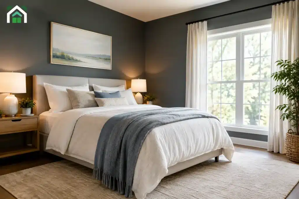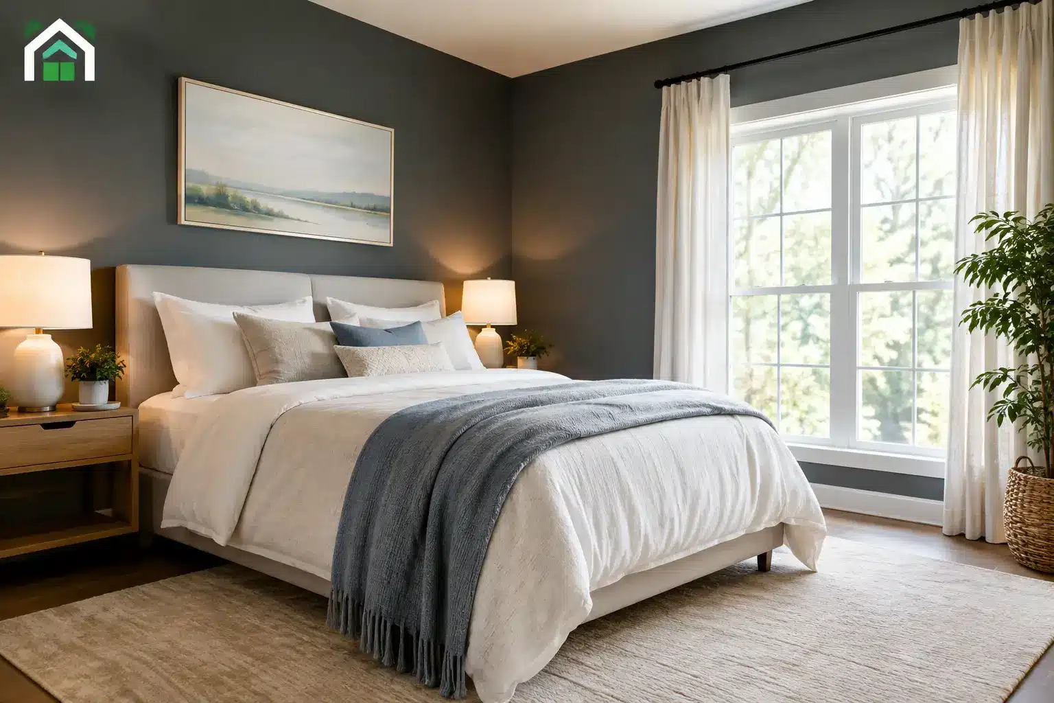

A north-facing bedroom in Denver can feel dim even at noon, while a basement family room may stay shadowy all day. Finding the best colors for dark rooms is not simply a matter of picking the lightest paint chip. The right choice depends on the room’s natural light, existing finishes, artificial lighting, and the feeling you want when the lights are on.
A pale color can make a dark room feel calm and open, but the wrong pale color may turn flat, cold, or gray. A deeper shade can create a comfortable, intentional retreat, but only if its undertone and finish work with the space. The goal is not always to make a dark room look like a sunroom. It is to make it feel finished, welcoming, and right for how you use it.
Why White Is Not Always the Answer
White is often the first recommendation for a room with limited daylight. It can work well, especially on ceilings and trim, but bright white walls tend to reflect whatever light is available. In a room with cool northern exposure or little direct sun, that reflection can read blue, gray, or stark rather than fresh.
Instead, consider a soft off-white with a warm or neutral undertone. Creamy whites, gentle ivory, and lightly warmed greige can hold their color better in low light. They still brighten the room, but they do not depend on strong sunshine to look inviting.
The existing surfaces matter just as much. If the room has honey-toned wood floors, beige carpet, brick, or warm cabinetry, a crisp blue-white can fight those finishes. A warm white or muted neutral usually creates a more connected result. Conversely, a room with charcoal flooring, black hardware, and cooler tile may look cleaner with a balanced white or a very subtle gray-beige.
Best Colors for Dark Rooms by the Mood You Want
The most useful starting point is deciding whether you want the room to feel lighter, warmer, quieter, or more dramatic. A paint color cannot create a new window, but it can change how intentionally the room uses its available light.
Soft warm neutrals for an open, comfortable look
Warm neutrals are reliable choices for hallways, guest rooms, offices, and living spaces with limited daylight. Look for soft beige, light taupe, pale mushroom, or warm greige rather than a gray with a strong blue undertone. These colors have enough body to avoid looking washed out on a shadowed wall.
A light neutral is also practical when a room connects to brighter spaces. It provides a gentle transition instead of making the darker room feel disconnected from the rest of the house. For homeowners preparing to sell, this approach often gives a room a broad, well-kept appeal without looking generic.
Muted greens for a grounded, natural room
Sage, olive-gray, and softened moss greens can be particularly effective in dark rooms. They tend to feel settled rather than gloomy, especially when paired with warm white trim, natural wood, and brass or bronze accents. A muted green works well in a den, dining room, powder room, or bedroom where comfort matters more than maximum brightness.
The trade-off is that green changes noticeably with the light. A sage that looks airy in a paint store may read cooler in a north-facing room. Sample it on more than one wall and check it in the morning, afternoon, and evening before committing.
Dusty blue and blue-green for calm without chill
Blue can make a low-light room feel peaceful, but the undertone is critical. Choose softened blue-gray, dusty slate, or a muted blue-green instead of a sharp, icy blue. These colors have more depth and tend to look intentional under lamps and overhead lighting.
In a room that already feels cool, balance blue walls with warm lighting, off-white trim, and warmer furniture or flooring. Without that balance, the room may feel more shaded than serene.
Blush, clay, and muted terracotta for warmth
For rooms that feel cave-like because of limited daylight, soft clay, pale peach-beige, dusty rose, and muted terracotta can add warmth that white paint cannot. These shades are especially good in dining rooms, powder rooms, and bedrooms because they look flattering in evening light.
Keep the saturation controlled. A dark room can handle color, but a highly saturated orange or red may feel heavy across four walls. Softer, earth-based versions provide warmth while remaining flexible with furnishings.
Deep colors when cozy is the point
Sometimes the best decision is to stop fighting the darkness. Rich charcoal, deep forest green, navy, aubergine, or chocolate brown can turn an underlit room into a purposeful, cozy space. This approach works beautifully in a media room, library, formal dining room, or small powder room.
Deep colors absorb light, so they will not make the room feel larger. What they can do is reduce the contrast between shadows and walls, making the space feel enveloping instead of unfinished. Use quality lighting and choose a sheen that adds a subtle lift without creating distracting glare.
Undertones Matter More in Low Light
Every paint color has an undertone, even when it looks neutral on a small swatch. Low natural light tends to reveal those undertones more strongly. Gray may lean purple, green, or blue. Beige may pull pink, yellow, or gold. White may look creamy, gray, or unexpectedly blue.
That is why a paint chip alone is not enough. Put large samples on poster board or paint test areas directly on the walls. Move them around the room and compare them near flooring, countertops, trim, and upholstery. Check the samples under daylight and under the lamps you actually use at night.
This step is especially worthwhile in Front Range homes, where bright high-altitude sun can make one side of a home feel very different from another. A color that looks warm in a sunny south-facing kitchen may appear much cooler in an adjacent north-facing hall.
Choose Sheen Carefully
Sheen affects how a color behaves in a dark room. More reflective finishes can help bounce light, but they also expose drywall flaws, patching, and uneven textures. A high-gloss wall is rarely the answer for a room that needs visual softness.
For most living areas, an eggshell or satin finish gives a modest amount of reflectivity and is easier to clean than flat paint. Matte finishes can look rich and forgiving on well-prepared walls, particularly with darker colors, but they do not reflect much light. In bathrooms, kitchens, and high-traffic areas, a durable satin finish is often the more practical choice.
Good prep matters here. Drywall repairs, texture matching, and careful sanding help paint reflect evenly. A low-light room can make wall imperfections more obvious once lamps cast light across the surface at an angle.
Support the Paint Color With Better Light
Wall color works with lighting, not apart from it. Replace mismatched bulbs before judging a sample. Warm white bulbs generally make beige, cream, green, and earth tones feel more inviting, while very cool bulbs can make many colors look dull or clinical.
Layering the light is more effective than relying on one ceiling fixture. A floor lamp near a dark corner, table lamps at seated height, and targeted task lighting can make the room more usable and help the paint show its intended character. Mirrors, lighter window treatments, and a ceiling color that is slightly lighter than the walls can also help distribute available light.
If the room has heavy curtains, dark screens, or exterior obstructions, address those factors before selecting paint. Color can improve the result, but it cannot fully compensate for a blocked window or inadequate lighting plan.
A Better Way to Make the Final Choice
Start with two or three color families rather than dozens of individual swatches. Once you know whether the room needs a warm neutral, softened green, gentle blue, or deeper cozy shade, narrowing the options becomes much easier. Test the finalists at full size, then view them alongside your trim and fixed finishes.
For a larger repainting project, professional color guidance can prevent expensive second guesses. At Majestic Painting Company, color selection is part of the on-site conversation, along with wall condition, repairs, sheen, and the way each room is used. A clear plan before painting starts helps the finished space look considered from every angle.
The best color for a dark room is the one that looks good in its real conditions, not just under store lighting. Give your samples a few days, turn on the lamps, close the curtains, and trust the color that makes the room feel like a place you want to spend time.